
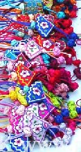
Funny, a few weeks ago the Studio Friday prompt was to share the color combinations that are distasteful for you. I posted the bright florescent purple and green, but yet I find that I am drawn to the bright almost florescent colors that Koreans use in some of their cultural products. Here are some Korean knots that I am drawn to - so I guess it's all in how the colors are used, in what context, that can make me like or dislike them.

No comments:
Post a Comment