I have been thinking about this prompt this week and thought of all of the times I've worked with images on my computer. Whenever I go to the color wheel to choose a color, I find very distasteful the bright almost flourescent colors. They look so garish to me. When choosing two of them to highlight, I questioned why it is that I dislike them so much... Then it came to me. I like more natural, earthy colors and don't like "fake" colors that don't necessarily appear naturally in the world around me. So here is a peek at two of the colors I do not use in my artwork and that I am turned off by.
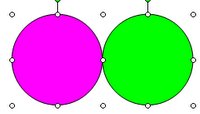
Now if these colors were more muted and not so bright and "in your face," I would like them. I'd like to learn more about the color wheel and color theory to more fully delve into this phenomenon.


5 comments:
This is so interesting to read/see, those are two of my favorites..think zinneas and sweet potato vine.
I'm with you, I totally do not like florescent colors! To think my friends and I all wore them in the late 80s. Ick! I found your blog at SF by the way. Have a great weekend!
I've always referred to those kinds of colors as "colors not found in nature", although I bet if you looked hard enough you could find your pink and green somewhere. Thinking back to my color theory classes, colors that are directly across from each other on the color wheel fight each other visually, especially if they're the same intensity. So, a lighter shade of either of your colors would work with the stronger one.
I don't like the "man made" intensity of these colors either. Muted, or natural, I like them a lot!
Interesting. For me it would depend on how they were used. Although, like the other poster commented, flourecent colors take me straight back to high school in the 80's
Post a Comment